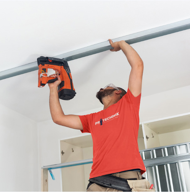
The Protechnik is a reliable and dedicated construction company that specializes in general construction as well as the renovation of shops and offices.
About
We centered our design approach for Protechnik on three key principles: customer-centricity, quality, and versatility.
Brand concept
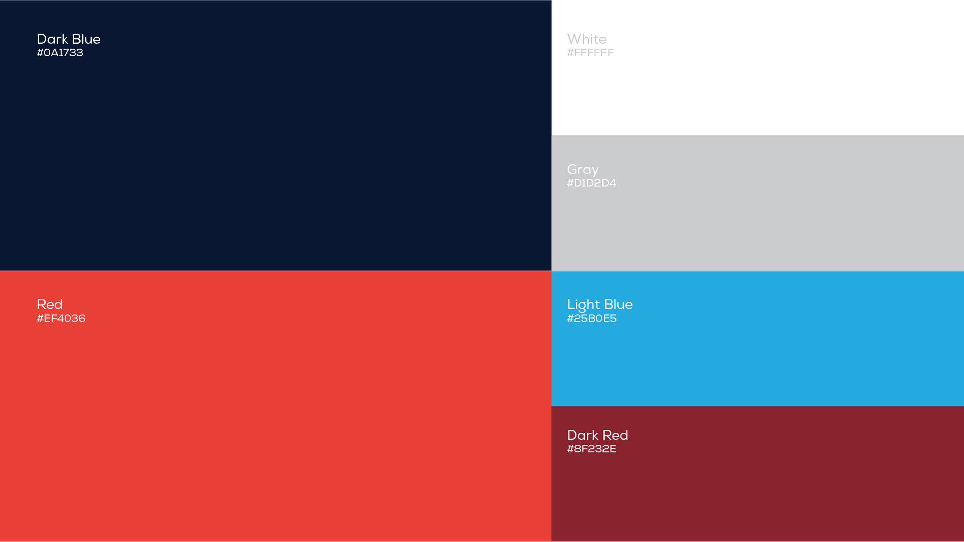
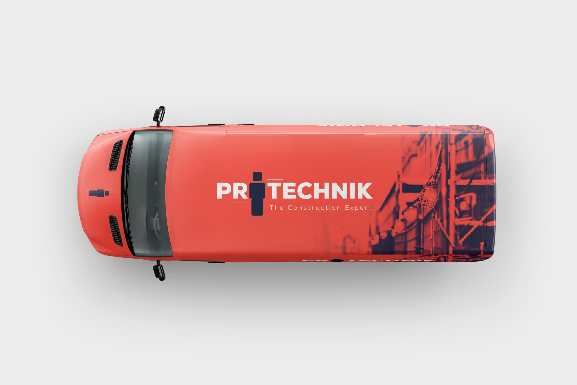
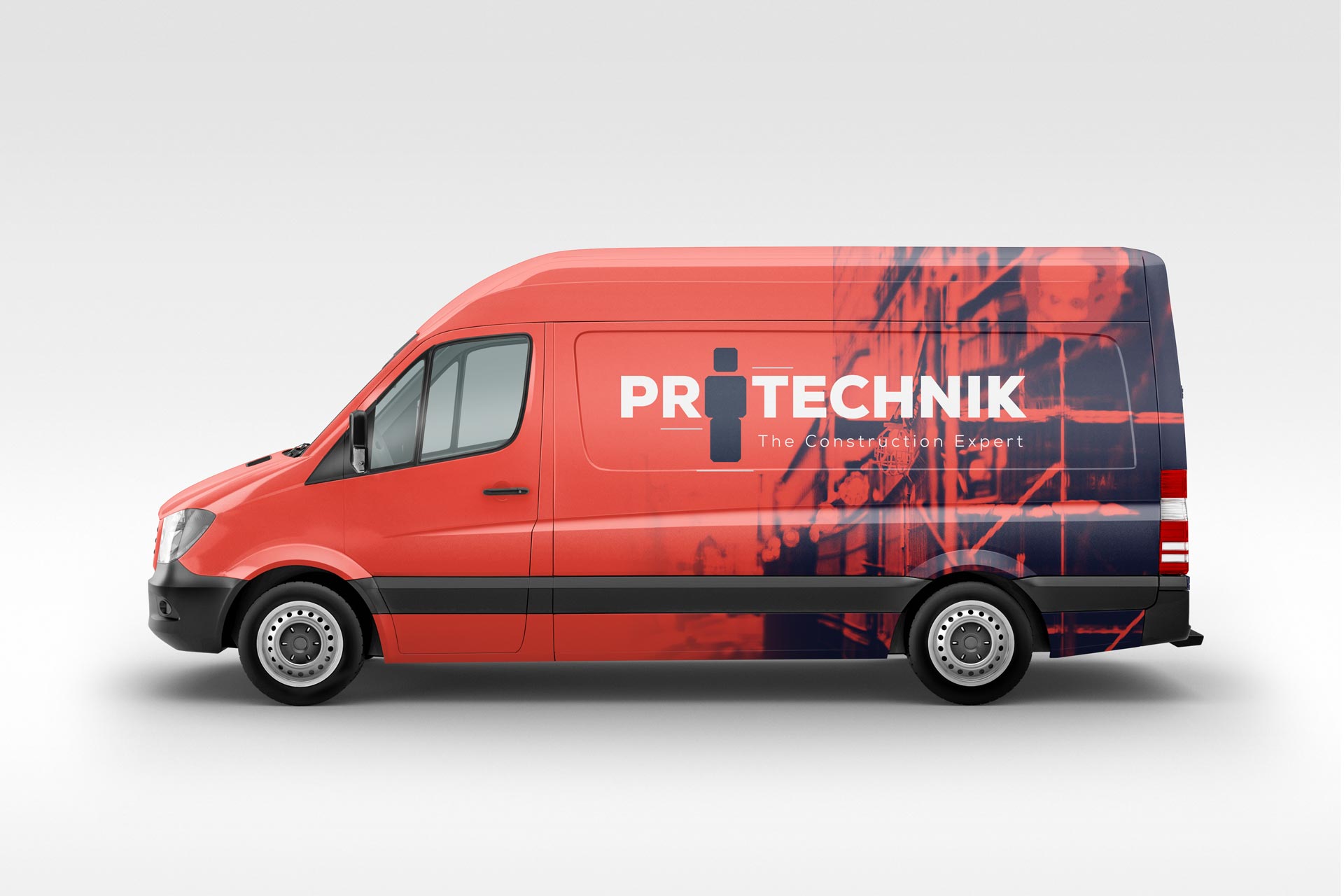
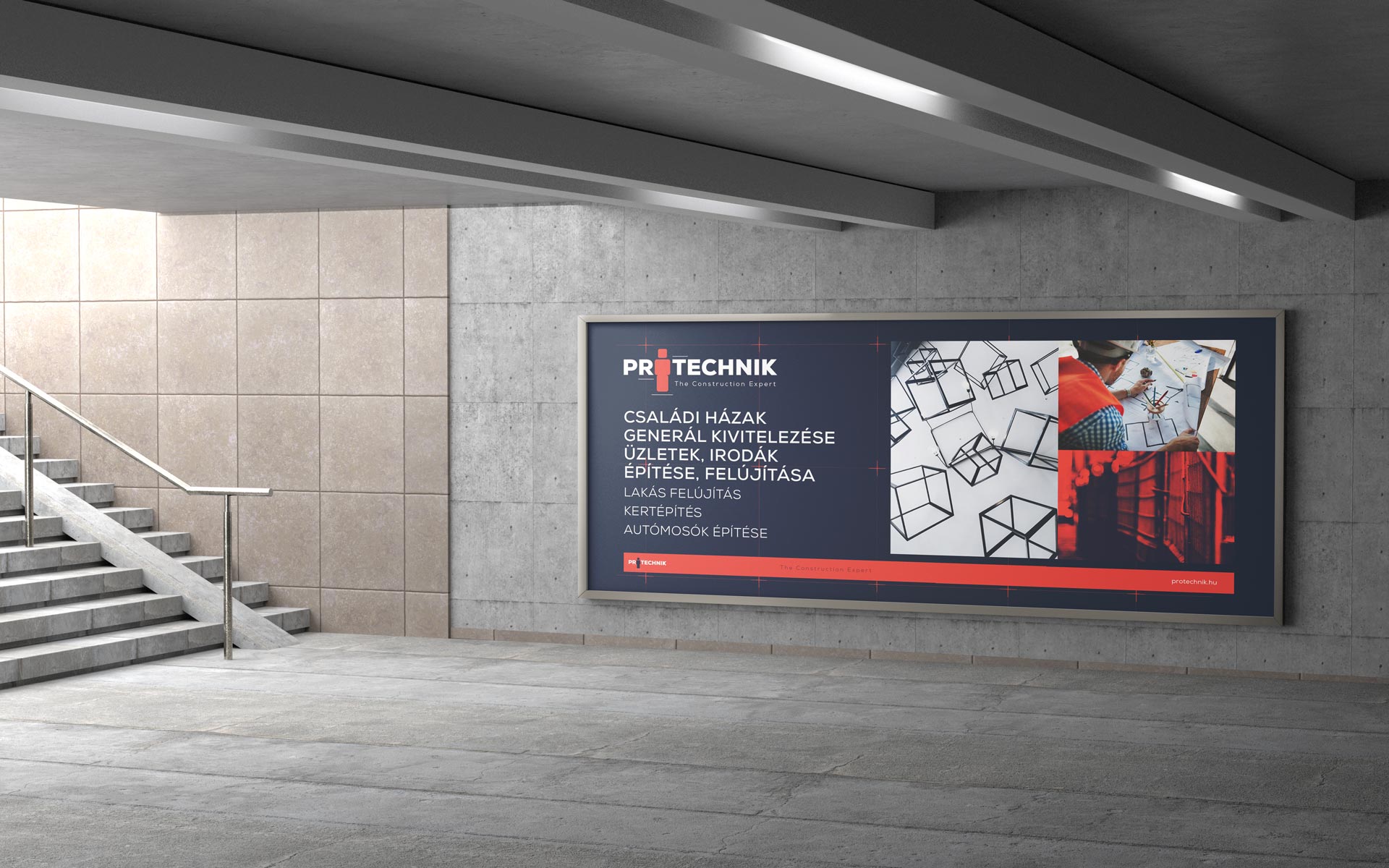
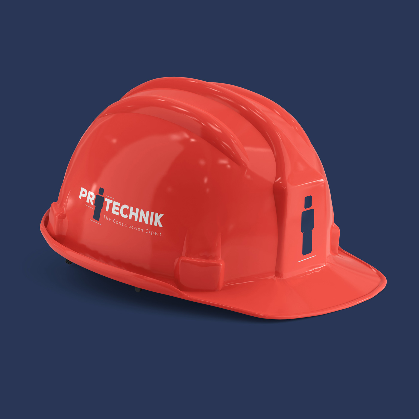
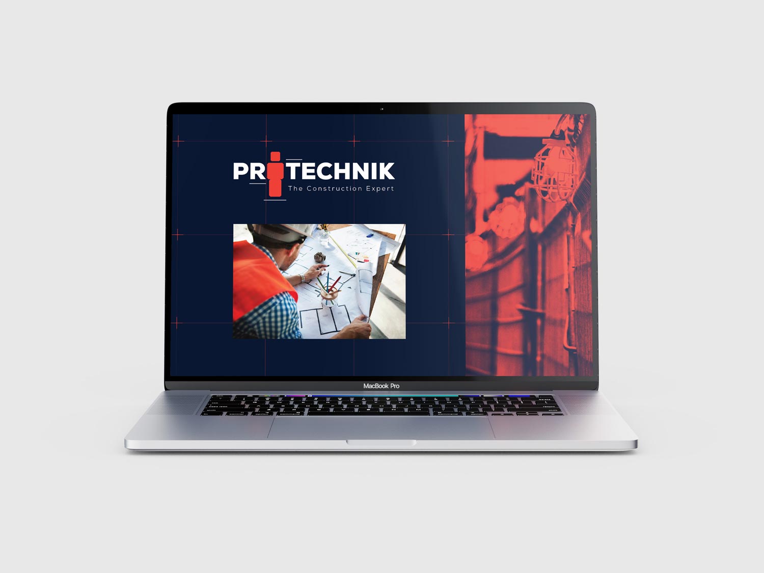
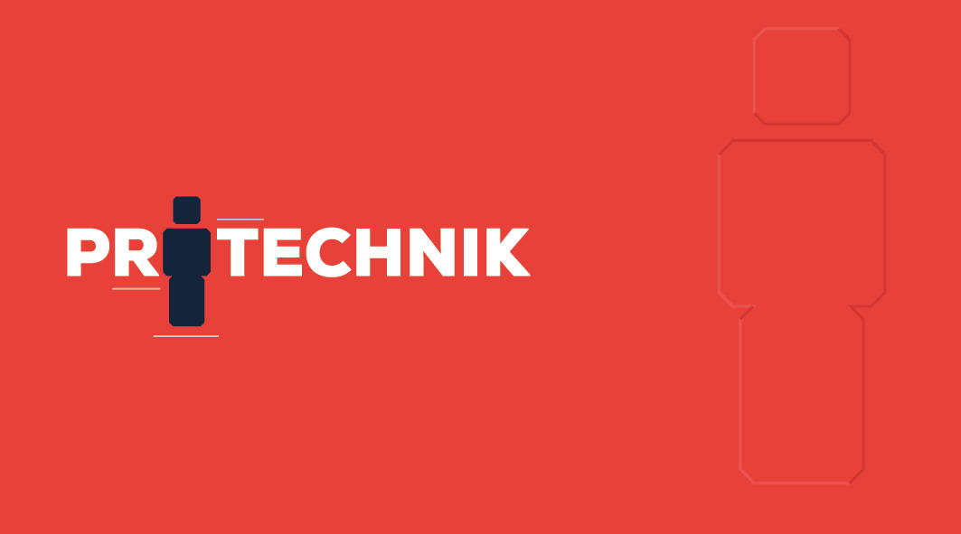
The strength of bold red and deep blue colors lies in determination and reliability. The foundation of our „Building with the Power of Red & Blue” brand concept is harnessing the power of strong color combinations to energize construction and renovation projects.
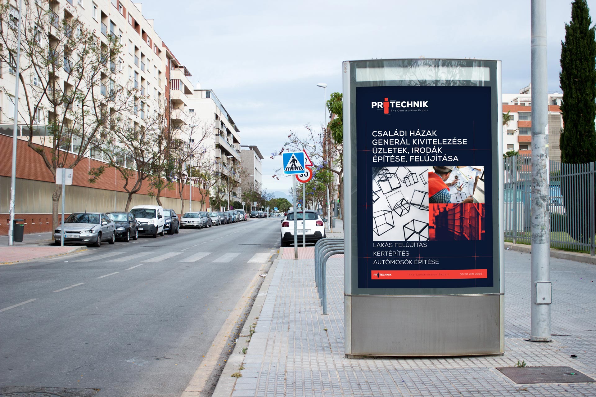
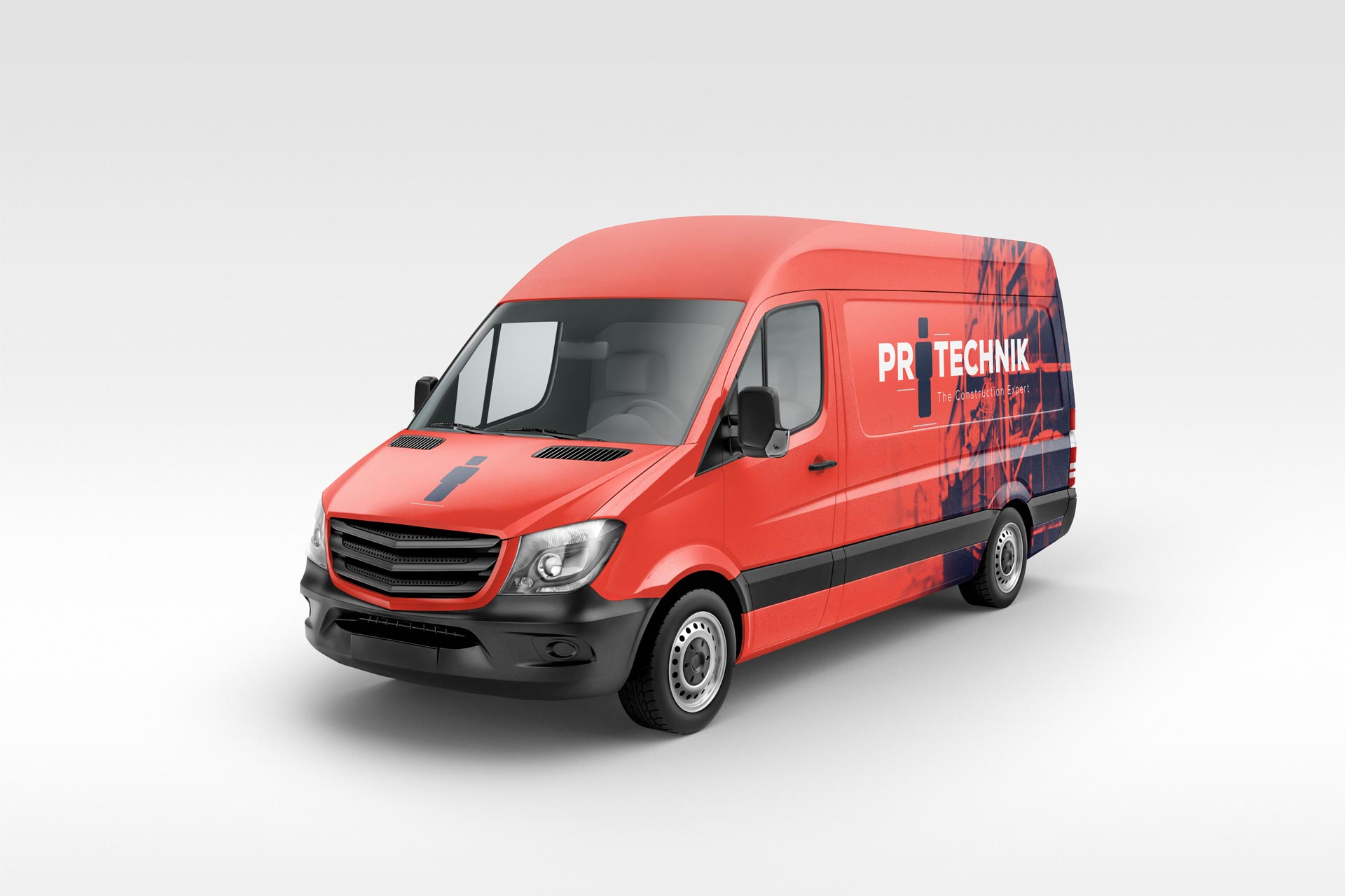
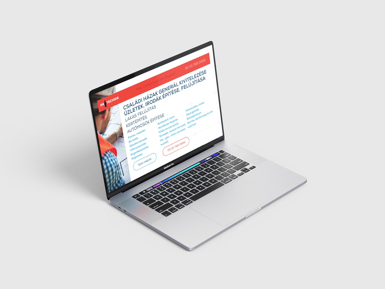
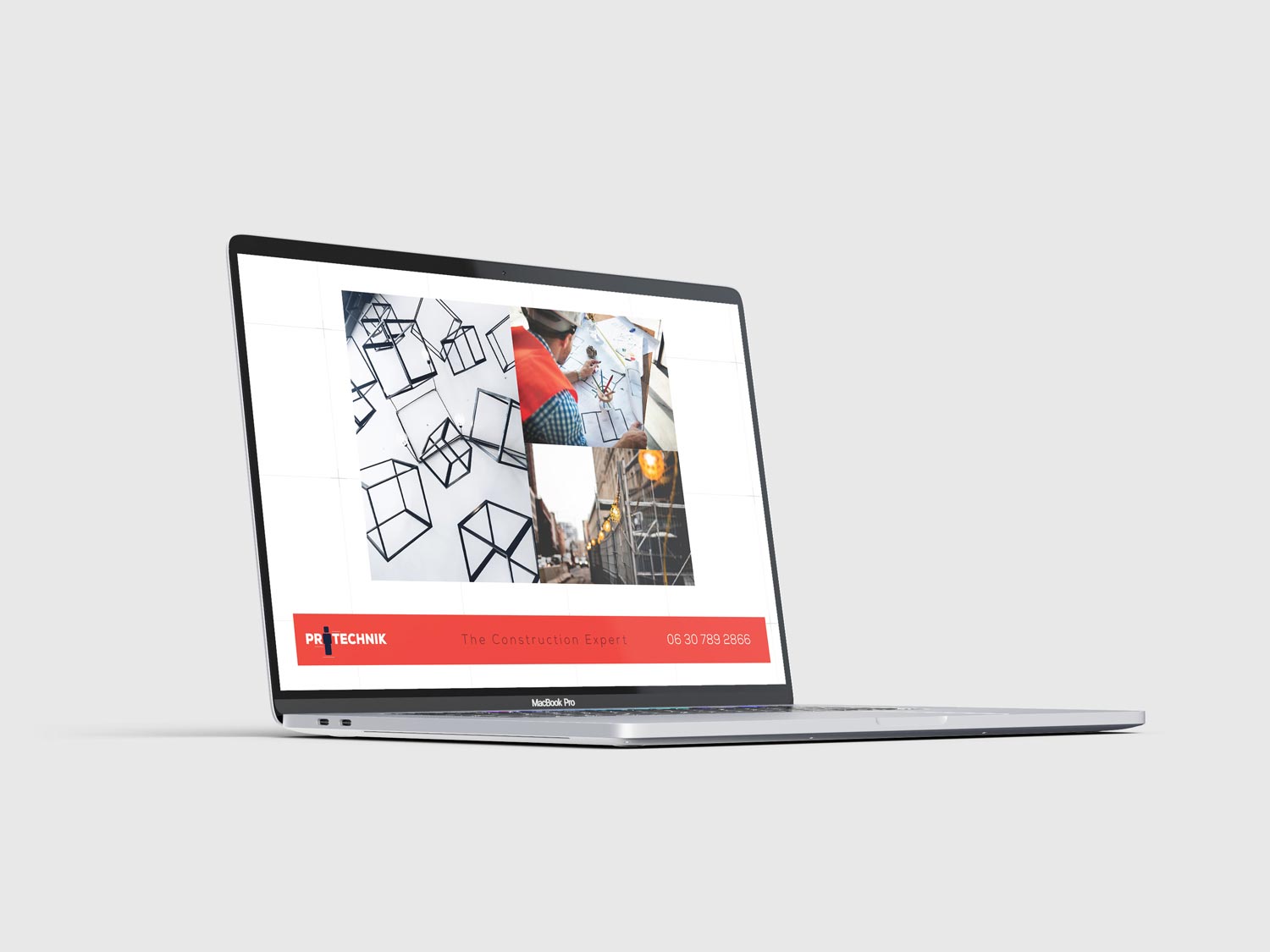
The outcome of the corporate identity design successfully reflects Protechnik’s values, people-centric approach, and commitment to quality. The new logo, color palette, and other branding elements align with the company’s personality, contributing to an enhanced sense of credibility and appeal.
Protechnik
mission
Designing the corporate identity for Protechnik was an inspiring and challenging project executed with a people-centered approach and close collaboration with the client. The result is an identity that mirrors the company’s values and uniqueness, aiding them in standing out amidst their competitors.